


Once again, a customer benefits from the positive synergies and effects of our BURN-IN concept. Customers, employees and, of course, the management enjoy the new corporate image and the resulting change in corporate culture.
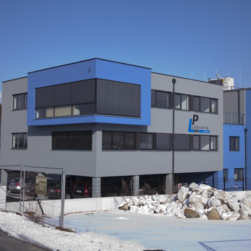
Together with Mr. Lederer (GF LP Logistik) and Ms. Klaushofer, Hanna Scheibenpflug and Sonja Dolzer developed an interesting interior art project that underlines the uniqueness of the Salzburg logistics company and will certainly cause a sensation in the media when the newly constructed company building opens in spring 2010.
Expressive visualizations, which were designed by dolzer.atvertising, clearly showed the planned image formats, colour compositions and shapes. The blue-grey color concept runs like a red thread through the building and symbolizes the movement and flow of traffic.
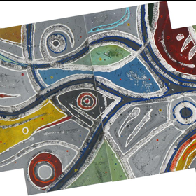
The decision was quickly made. Hannanas cycle from the Connectable Landscapes, the incomparable three-dimensional styros that BURN-IN has already presented at the Salzburg Art Fair, was very well received and was expanded to include a number of works.
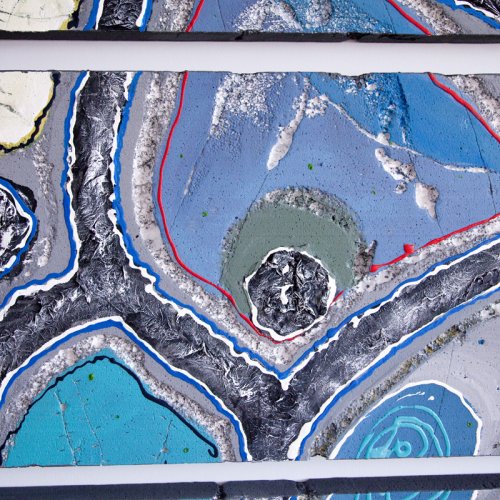
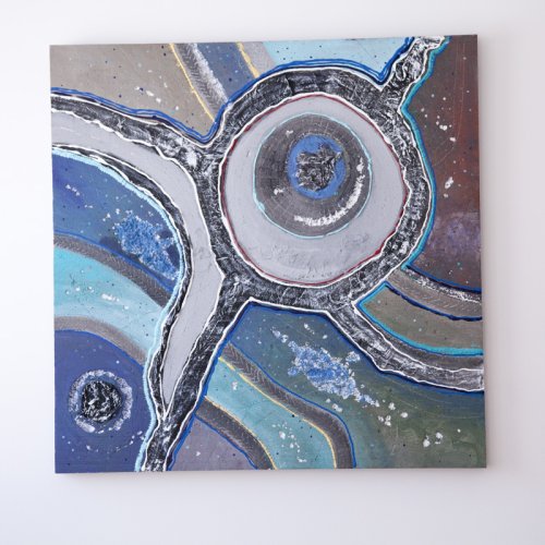
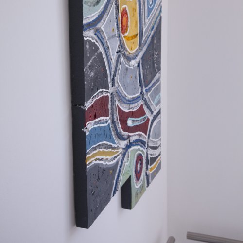
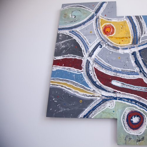
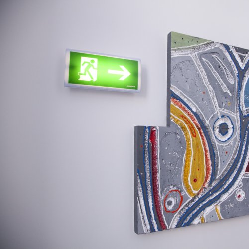
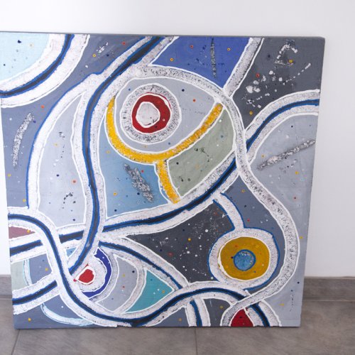
Maps and landscapes are of course a perfect fit for a logistics company. The Connectables unite the most diverse countries and break down barriers not only on the map. Everything moves closer together. Roads, traffic circles, intersections and tire tracks in the company colors characterize the works. Lightfast acrylic paints, collaged papers and various techniques such as etching, scratching and scratching create a 3D effect and give the works depth. Unique features welcome visitors in the entrance area and lead them up the multi-storey staircase to the top level with the bright conference room.
A lot of connectables, which were connected in various forms and thus also connect a lot. To give you an idea, we present the composite staircase cycle in the illustration.
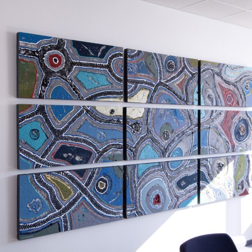
In the conference room, we installed an imposing 9 divider (300 x 150 cm) and a rhombus (100 x 100 cm) offset by 45 degrees. In the entrance area, there are 4 staggered styros and another rhombus (100 x 100 cm).
A very interesting BURN-IN project! Sparkling art branding at its best!
"Where art, space and corporate identity come together precisely, more than just design is created: a working environment with character, direction and a unifying effect is created."
Rooms that should radiate more than function?
What makes this project special
Interior art with a corporate connection
Art is used in a targeted way to visibly strengthen identity, spatial impact and corporate culture.
Color and shape concept with a common thread
The blue-grey color concept symbolizes movement and traffic flow and unites the building into a coherent whole.
Connectable Landscapes as a precise cycle in terms of content
Maps, roads, intersections and tire tracks artistically take up the theme of logistics and create a high degree of recognizability.
Art as a route through the building
The entrance area, staircase, conference room and foyer are spatially connected by a coherent interior art concept.
Relevance for corporate culture and external impact
The project shows how art not only enhances spaces, but also changes perception, identification and atmosphere.